
Launching an AI writing tool on Product Hunt requires more than a strong product. The way the product looks, communicates its value, and demonstrates its user experience can strongly influence how potential users understand it. Product Hunt launch screenshots are especially important because they often provide the first visual explanation of what an AI writing product does, how it works, and why someone should try it.
A thoughtful UX comparison can also reveal whether your interface feels simpler, faster, and more useful than competing writing platforms. This guide explains how to prepare screenshots, compare UX patterns, communicate features, structure a Product Hunt launch, and create visuals that support conversions. Whether you are launching an AI copywriting assistant, research writer, content generator, or productivity-focused writing platform, the goal is the same: make the product easy to understand, visually credible, and genuinely useful.
What Makes an AI Writing Tool Product Hunt Launch Successful
A successful Product Hunt launch starts with a clear value proposition. Visitors should quickly understand what the AI writing tool does, who it helps, and what problem it solves. If the message requires several paragraphs before the product makes sense, many visitors may move on.
AI writing is a crowded category. Users already know that AI can generate text, rewrite paragraphs, summarize information, brainstorm ideas, and help with editing. Your launch therefore needs to communicate what makes your product different.
The difference could come from workflow, specialization, usability, speed, integrations, output quality, or a particular audience. For example, an AI writing tool designed for academic brainstorming has a different value proposition from one designed for marketing teams.
Your Product Hunt page should make that distinction obvious. The product screenshot, headline, description, and supporting copy should all communicate the same core benefit.
Why Product Hunt Launch Screenshots Matter for AI Writing Products
Screenshots turn abstract software features into something people can understand immediately. Saying that an AI writing tool has “advanced workflow automation” sounds impressive, but a screenshot showing the workflow can make the feature much easier to understand.
For an AI writing product, screenshots can demonstrate the complete experience. You might show the initial prompt, generated draft, editing interface, document organization, tone controls, research panel, or export workflow.
Good screenshots should answer questions naturally. What does the interface look like? Is it easy to use? Where does the user begin? What happens after entering a prompt? How much control does the user have over the generated content?
Visual evidence builds credibility. A visitor can see the actual product instead of relying entirely on marketing claims. This becomes particularly valuable for new products without a large collection of reviews or established brand recognition.
How to Choose the Best Screenshots for a Product Hunt Launch
Do not simply upload every screenshot you have. A Product Hunt launch works better when each visual has a specific purpose.
Start with your strongest screen. This should communicate the primary value of the AI writing tool without requiring extensive explanation. If your product creates structured articles, for example, the first screenshot could show the writing workspace and the generated result together.
Your next screenshots can demonstrate supporting features. Useful examples include AI editing, content customization, templates, research assistance, document management, collaboration, integrations, and export options.
Avoid screenshots that show empty dashboards, complicated settings, error messages, or unfinished interfaces unless they are necessary to explain the product. The goal is to create a visual journey from problem to solution.
A strong sequence might look like this:
- Product overview
- Main writing workflow
- AI generation or editing feature
- Customization controls
- Collaboration or productivity feature
- Final output or export
This sequence gives potential users a simple mental model of how the product works.
Designing AI Writing Tool Screenshots for Better UX
Screenshot design should reflect the actual user experience. If the interface looks cluttered, the screenshot can make the product appear complicated even when the underlying workflow is simple.
Use screenshots with enough visual context to show the product clearly. Important interface elements should remain readable, while unnecessary browser tabs, personal information, notifications, or unrelated controls should be removed.
Annotations can help, but use them carefully. A few short labels can direct attention to important features. Covering the entire interface with arrows and text can have the opposite effect.
Clarity should come before decoration. A screenshot does not need excessive gradients, oversized typography, or complicated visual effects to look professional. A clean interface with clear hierarchy often creates more trust.
AI Writing Tool UX Comparison: What Should You Analyze?
A UX comparison should examine more than colors and visual style. The most important question is how efficiently a user can complete a meaningful task.
Start by comparing the first-use experience. How quickly can a new user understand where to start? Does the interface provide useful guidance? Is the main action obvious?
Then compare the writing workflow. How many steps does it take to generate useful content?
Also evaluate feedback.
A good UX comparison focuses on task completion, cognitive load, discoverability, consistency, and user control, rather than simply deciding which interface looks prettier.
Comparing AI Writing Interfaces and User Workflows
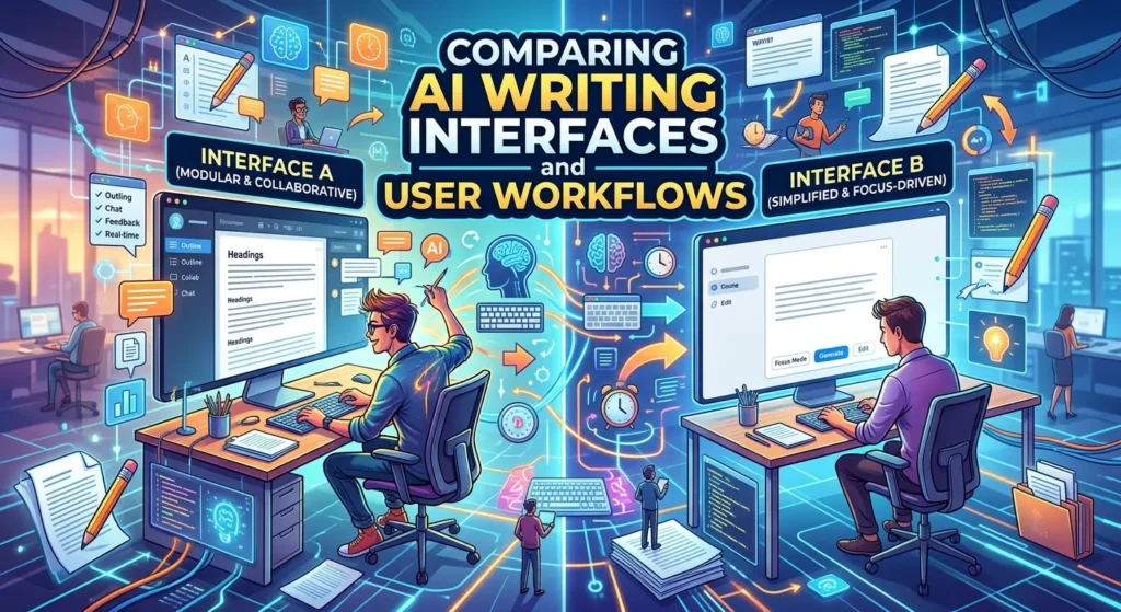
Different AI writing products can approach the same task in very different ways. One platform may begin with a blank editor, while another starts with a guided content brief.
A blank editor provides flexibility, but beginners may not know what to enter. A guided workflow can make the experience easier, although experienced users might find it restrictive.
Another important difference is where AI controls appear. Some interfaces place AI actions beside the document, while others integrate them directly into the writing experience.
For example, users may want to highlight a paragraph and ask the AI to rewrite it instead of opening a separate generation window. This small UX decision can significantly affect productivity.
When comparing competitors, ask: Does the interface help users stay focused on the task, or does it constantly interrupt their workflow?
How Product Screenshots Communicate Features Without Overexplaining
A screenshot should support your written explanation rather than duplicate it.
Suppose your AI writing tool offers automatic tone adjustment. Instead of writing a long paragraph explaining the feature, show a piece of text with the tone control visible and demonstrate the difference between two outputs.
Similarly, if the product supports content templates, show the template selection process. If it offers document collaboration, show the collaboration interface. If it provides research assistance, show how sources or research notes appear in the workspace.
This approach creates feature storytelling. Each screenshot answers one question and moves the visitor closer to understanding the product.
Avoid making every screenshot a feature catalog. Too many visible buttons can overwhelm visitors. Select visuals that represent the most important use cases.
Product Hunt Launch Copy and Screenshot Alignment
Screenshots work best when the surrounding launch copy gives them context. Your headline should communicate the primary value, while the screenshots provide visual evidence.
For example, if the core positioning is “AI writing for faster research-based content,” the screenshots should show research, drafting, editing, and final output.
If the positioning says “AI writing without leaving your existing workflow,” the screenshots should demonstrate the relevant integration or workflow.
This alignment matters because inconsistent messaging can create confusion. If the launch description focuses on simplicity but the first screenshot contains a complicated dashboard, visitors may question the product’s positioning.
Your messaging and visuals should tell one story. The visitor should understand the product even if they only skim the page.
Free vs Paid Features in an AI Writing Tool Launch
Pricing is an important part of product positioning. Many AI writing products offer free trials, limited free plans, paid subscriptions, or usage-based pricing.
When preparing a Product Hunt launch, explain the free experience clearly. Users want to know what they can actually test without committing to a subscription.
If your free version includes a limited number of generations, explain the limitation. If premium plans unlock additional models, higher usage, collaboration, integrations, or advanced controls, communicate those benefits clearly.
Avoid making the pricing structure unnecessarily complicated. Simple pricing communication reduces friction.
Screenshots can also demonstrate the difference between free and premium capabilities, but avoid making the launch feel like a sales presentation. The primary goal should be helping visitors understand the product and its value.
Integrations That Improve AI Writing Tool UX
Integrations can make an AI writing product more useful because users often work across multiple applications.
Depending on the product, useful integrations may include document editors, cloud storage, content management systems, project-management platforms, communication applications, calendars, publishing systems, or developer tools.
However, integrations should solve real workflow problems. Adding dozens of integrations simply to increase a feature count can make the product harder to maintain and explain.
When showing an integration in a launch screenshot, demonstrate the actual workflow benefit. For example, show how a user moves a completed draft from the AI writing tool into another application.
The strongest integration story is not “we connect with many tools.” It is “you can complete your existing workflow with fewer manual steps.”
Common UX Mistakes in AI Writing Tool Launches
One common mistake is showing screenshots that are too small. If visitors cannot read the interface, the screenshot loses much of its value.
Another problem is showing too much information. A screenshot packed with menus, buttons, pop-ups, and annotations can make a simple product appear complicated.
Some launches also focus heavily on AI generation while ignoring editing. Users do not simply want text generation; they often need to review, refine, organize, and publish the result.
Another mistake is making unrealistic claims. Avoid suggesting that an AI tool always produces perfect, original, accurate, or publication-ready content. AI output can require human review.
Trust is especially important for writing software. A clear explanation of what the tool does and where users should verify information can make the product appear more credible.
How to Compare Your AI Writing Tool With Competitors
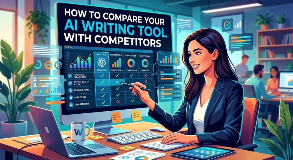
Competitive comparison should focus on meaningful user outcomes rather than vague claims such as “better AI.”
Start by identifying the major alternatives users might consider. These could include general AI assistants, specialized writing platforms, traditional writing software with AI features, or manual workflows.
Compare the products using consistent tasks. For example, give each tool the same writing brief and evaluate workflow simplicity, customization, editing, organization, and final usability.
Do not judge output quality from a single generation. AI responses can vary. A stronger comparison uses multiple realistic tasks and evaluates the overall experience.
Also consider time to first useful result. A tool that produces an acceptable draft in two minutes may be more useful to a specific audience than one that produces a slightly different result after a much longer workflow.
AI Writing Tool Product Hunt Launch Checklist
Before publishing your launch, review every part of the experience.
First, make sure the product is functional. Test the main workflow from beginning to end. Fix obvious errors before sending visitors to the product.
Next, review the screenshots. Make sure they show the current interface, use readable text, contain no private information, and demonstrate meaningful features.
Your launch page should also have a clear product name, concise positioning, useful description, screenshots, pricing information, and an easy way to try the product.
Check your messaging from the perspective of someone who has never heard of the product. Can they understand the problem, solution, audience, and primary benefit in less than a minute?
Finally, prepare to answer questions. Product Hunt launches can generate useful feedback about pricing, UX, features, positioning, and onboarding. Treat those conversations as product research rather than simply promotional activity.
Latest Trends in AI Writing Tool UX and Product Launches
AI writing interfaces are increasingly moving away from simple “enter prompt and generate text” experiences. Modern products often combine generation, editing, research, organization, personalization, and automation inside one workflow.
Another major trend is contextual AI. Instead of requiring users to repeatedly explain what they want, AI systems increasingly use information from the document, workspace, project, or selected text.
Multimodal workflows are also becoming more common. Writing applications can increasingly work with documents, images, files, structured data, and other forms of context.
For launch screenshots, this means product teams should demonstrate complete workflows rather than isolated AI buttons. A screenshot of a prompt box says little about the overall product. A visual showing how a user moves from idea to finished work tells a much stronger story.
Future UX will likely emphasize user control as AI becomes more capable. Users will want to understand what the system generated, modify it easily, preserve their original work, and decide when automation should occur.
Future of AI Writing Tool Product Hunt Launches and UX Comparison
The future of AI writing products will likely focus increasingly on collaboration between humans and AI rather than simple automatic text generation.
AI systems may become better at understanding project context, maintaining consistent writing styles, organizing research, and assisting with multi-step workflows. This could reduce the need for users to repeatedly copy information between different applications.
Product Hunt launches will also need to communicate these capabilities visually. Static screenshots may increasingly be supported by interactive demonstrations, short product videos, animated workflows, and clearer before-and-after examples.
UX comparisons will become more sophisticated as well. Instead of asking which product has the most features, users will increasingly ask which tool helps them achieve a real outcome with the least friction.
For product teams, this creates an important opportunity. The strongest AI writing tool may not be the one with the longest feature list. It may be the one that understands the user’s workflow and makes difficult writing tasks feel simple.
Conclusion:
A successful AI writing tool Product Hunt launch combines product quality, clear positioning, strong screenshots, thoughtful UX, and honest communication. Screenshots should demonstrate real workflows rather than simply display attractive interface designs.
UX comparison should examine how easily users can discover features, complete tasks, edit AI-generated content, understand results, and move through the product without unnecessary friction.
The most effective launch strategy is simple: show the problem, demonstrate the workflow, highlight the unique value, and make the product easy to try.
As AI writing becomes increasingly competitive, differentiation will depend less on simply claiming that a product uses AI. Users will care about the quality of the experience, the usefulness of the output, the amount of control they have, and how naturally the tool fits into their existing workflow.
A carefully designed Product Hunt presentation gives your product an opportunity to communicate those advantages quickly and credibly.
FAQs About AI Writing Tool Product Hunt Launches
What screenshots should an AI writing tool use on Product Hunt?
Use screenshots that demonstrate the main workflow, AI generation, editing experience, key features, and final result. Prioritize clarity over quantity.
How many screenshots should an AI writing tool launch include?
There is no universal number. A small collection of highly informative screenshots is usually more effective than uploading every available screen.
What makes an AI writing tool screenshot effective?
An effective screenshot has a clear purpose, readable interface elements, minimal distractions, and enough context to help visitors understand the feature.
Should screenshots include text annotations?
Yes, when annotations improve understanding. Keep them short and focused. Too many labels can make the visual confusing.
How should I compare my AI writing tool with competitors?
Use the same realistic tasks for each product and compare workflow, usability, customization, editing, speed, integrations, and overall user experience.
Should I show pricing in a Product Hunt launch?
Yes. Clear pricing or trial information can reduce uncertainty and help visitors understand how they can evaluate the product.
Can AI writing tools replace human writers?
AI can automate parts of writing and editing, but human judgment remains important for accuracy, originality, context, expertise, strategy, and final review.
What is the most important part of an AI writing tool launch?
The most important element is a clear value proposition supported by a simple product experience. Visitors should quickly understand what the tool does and why it is useful.
How can screenshots improve conversion?
Good screenshots reduce uncertainty by showing the actual product. They help potential users understand the interface and visualize how the tool could fit into their own workflow.
What should I avoid in an AI writing tool Product Hunt launch?
Avoid cluttered screenshots, exaggerated AI claims, unclear pricing, outdated product images, feature overload, and messaging that does not match the actual user experience.